Unbound:
Navigation + User Flow
Stakeholder and user interviews to uncover what is at the heart of the right experience. (2019)
The problem
Unbound's navigation had become unwieldy and difficult to use. Content was organized around internal structures rather than user needs, making it challenging for visitors to find what they were looking for. Each department viewed their content as a priority, resulting in a navigation where everything competed for prominence—and ultimately, nothing stood out.
The disconnect between what stakeholders wanted to highlight and what users actually needed created friction in the experience. The site needed a navigation strategy grounded in user research and real-world behavior.
Challenge
As Web Director, I needed to balance competing priorities while ensuring the navigation truly served our users. The challenge was facilitating alignment across the organization and using research to guide prioritization decisions. The solution also needed to embrace a mobile-first approach, ensuring the experience was optimized for any device type.
Goals
We set out to understand how to organize and prioritize content to align with user needs. Through our research, we sought to learn what motivated users to engage with Unbound and become sponsors or donors. Our goal was to let user behavior—not internal structure—guide the navigation strategy.
Methods
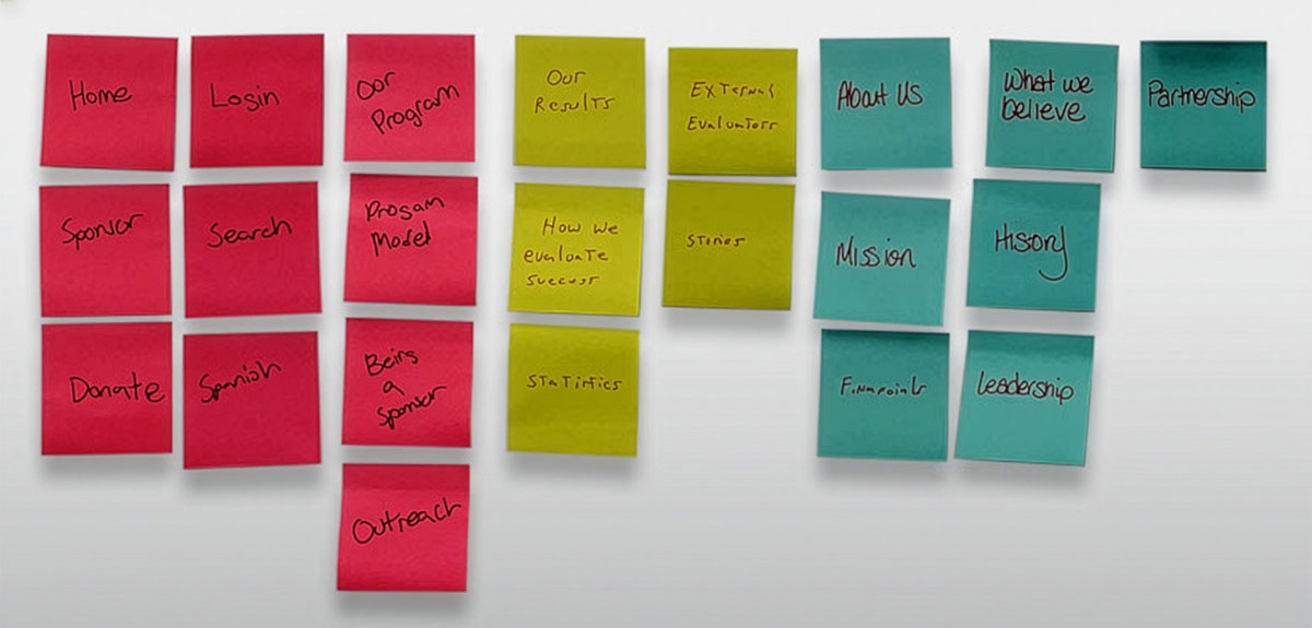
I conducted interviews with approximately a dozen stakeholders—team leads from each department—as well as a handful of sponsors who volunteered with the organization. We tabulated our findings and conducted post-it exercises with interviewees to map out and prioritize site functions. This collaborative approach helped build consensus and ensured all voices were heard.
We performed extensive content inventory and audits, and leveraged analytics to understand user demographics and device preferences. This data informed our mobile-first approach and validated what we were hearing in interviews.
Insight
A key insight challenged conventional wisdom: it wasn't as simple as burying content under fewer navigation choices and hoping users could find what they needed. Instead, we learned it was beneficial to flatten some of the site structure, giving visibility to more information, and then guide users toward priorities through content cues rather than restrictive navigation hierarchies.
Design Process
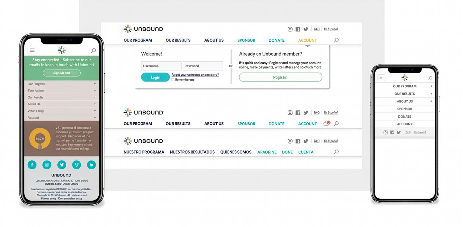
Understanding the technology was critical—we needed code optimized to respond to device viewport, allowing us to alter the UI effectively across screen sizes.
Ideation & Prototyping
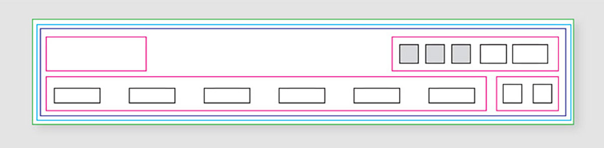
We started with wireframes to understand the box model and establish a flexible foundation for our mobile-first approach.
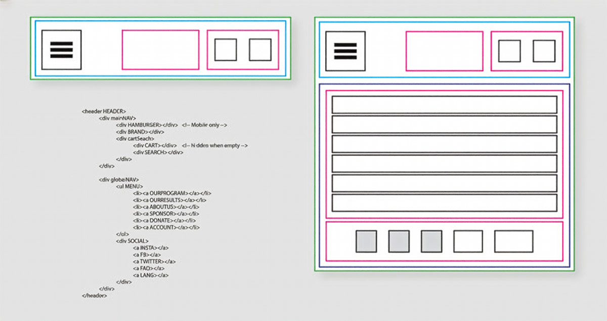
From there, we worked through high-level wireframes to organize navigation items on screen. This iterative process allowed us to test different arrangements and validate our information architecture before committing to visual design.
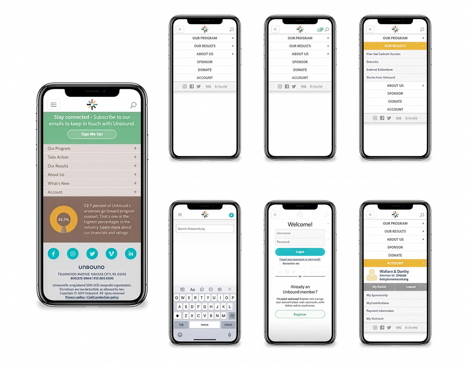
Key Decisions
Color, font weight, and decoration played crucial roles in establishing visual hierarchy. Rather than relying solely on navigation structure to guide users, we used these visual cues to create clear pathways and emphasize priority content. This approach maintained a flatter, more accessible structure while still directing users toward key actions like sponsorship and donations.
Final Design
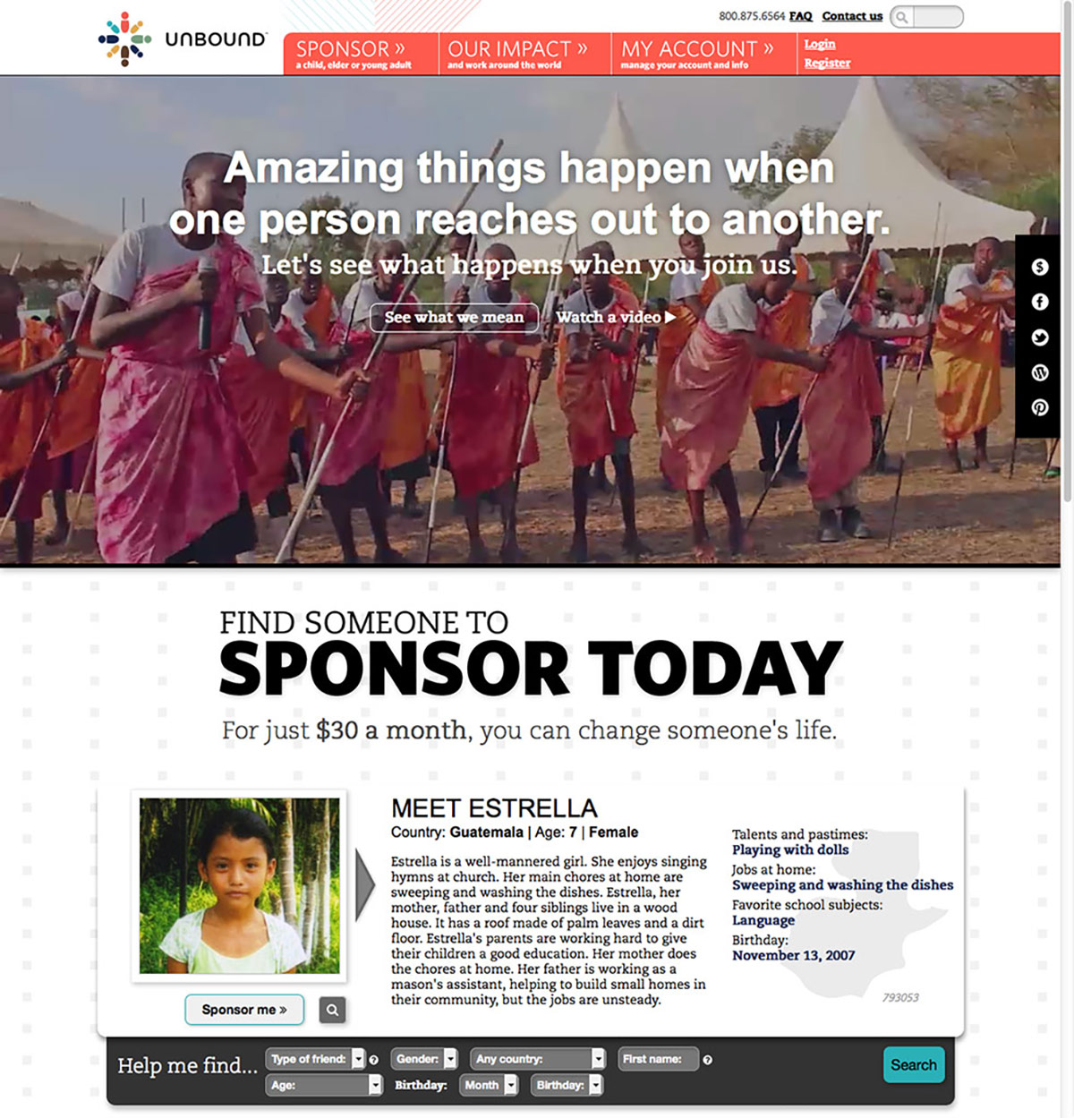
The final navigation delivered a clean, inviting interface that resonated with Unbound's audience. By flattening the site structure and using visual hierarchy to guide users, we created a system where content was more discoverable without feeling overwhelming. The mobile-first approach ensured a consistent, optimized experience across all devices.
Impact
The new navigation was widely praised across the organization. Stakeholders felt content was easier to find and well organized. More importantly, users could find and understand how to sponsor someone or make a donation with ease.
User engagement increased significantly, with visitors spending more time on the site. The balance between accessibility and prioritization proved successful—users could discover what they needed while being guided toward meaningful engagement with Unbound's mission.
Takeaways
Ultimately, we are building and improving systems for the user. Balancing stakeholder wants with user needs is critical to creating effective solutions. Through research and collaborative workshops, we landed somewhere very different than initially expected—but the outcomes validated our approach. The project not only improved functionality but gave the site a much cleaner, more appealing experience that better served Unbound's mission.