Tinxa Finance:
Customer Portal
Empowering users with account management tools that are simple, intuitive, and online. (2025)
The problem
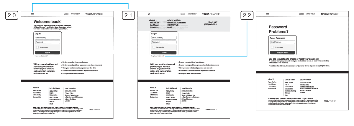
Following Tinxa's loan application launch, customers needed a portal to complete their loan process and manage accounts. The challenge was serving two phases: e-Signature for pre-approved applicants and ongoing account management for funded loans.
Challenge
As Lead UX/UI Designer and Frontend Developer, I built the Customer Portal from scratch in 2025, translating complex requirements into a clean interface that adapted to different loan statuses while keeping users focused on their current loan. The portal needed flawless cross-device performance with critical information—upcoming payments and account status—immediately clear.
Goals
We aimed to empower users through every aspect of their loan journey. Based on research, we kept things clean and focused, eliminating distractions. Even with repeat customers, the portal focused exclusively on the current loan, with all navigation, messaging, and functionality tailored toward managing and paying off that balance.
Methods
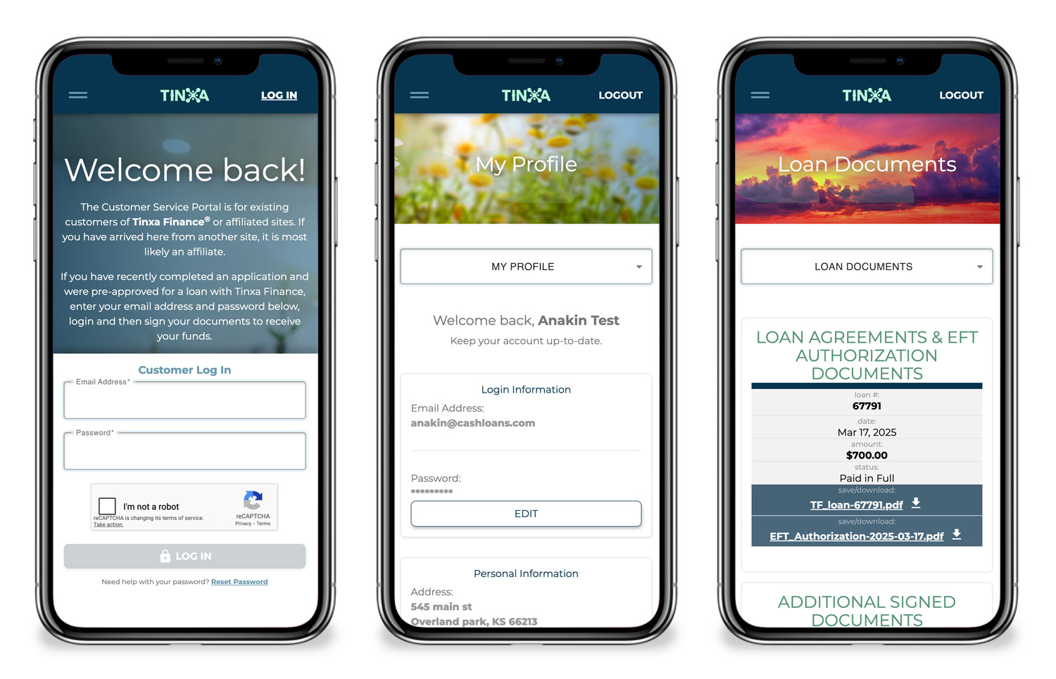
We conducted competitive research to identify best practices and worked with stakeholders to translate business requirements into user-centered design. With most traffic being returning mobile users, mobile-first design was essential.
Insight
Users need what's relevant right now, not everything at once. Customizing the portal based on loan status and focusing just on the current loan, created a dramatically cleaner experience.
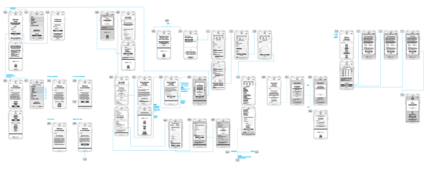
Design Process
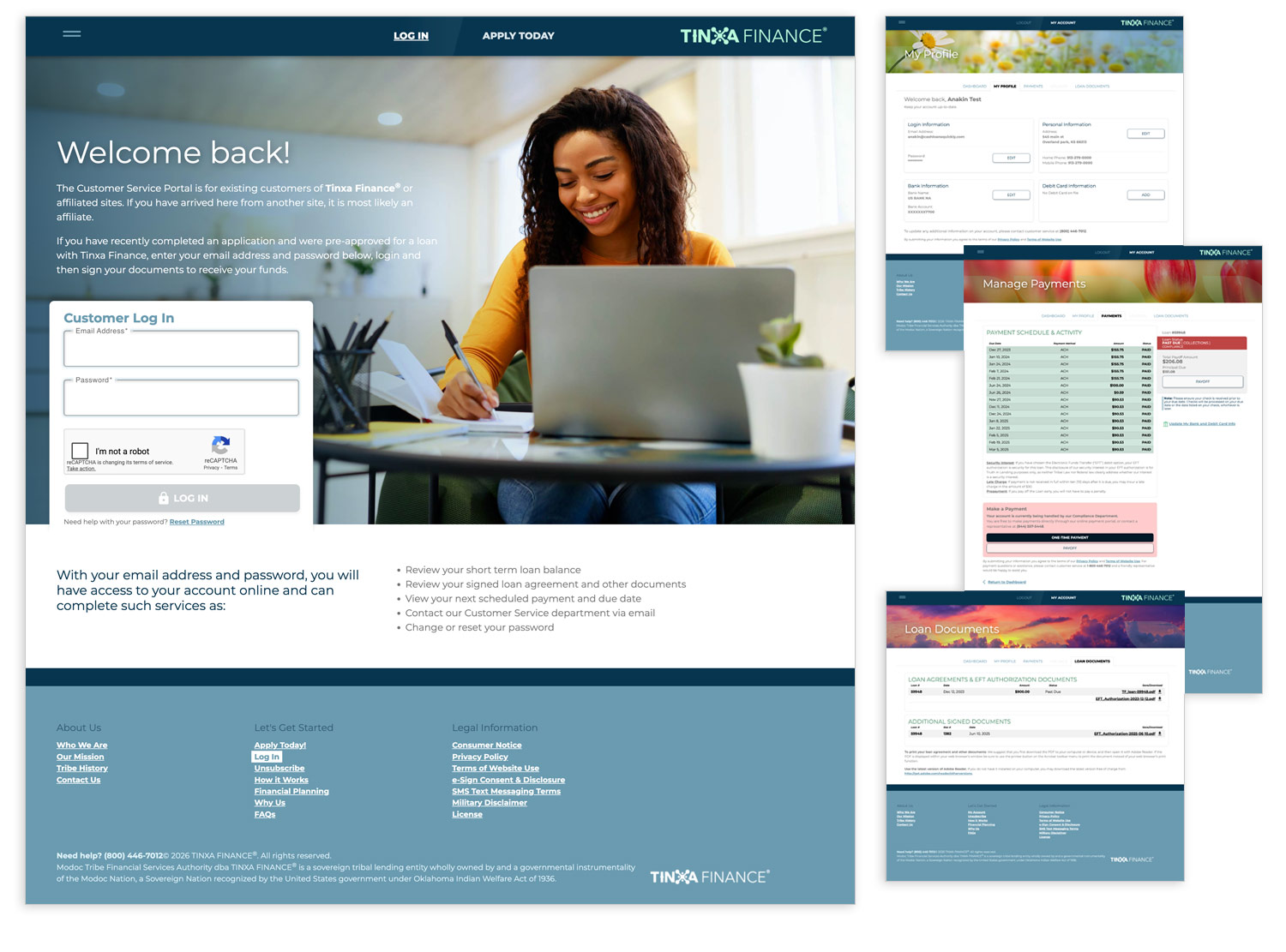
We structured the portal around five core sections:
- Dashboard
- My Profile
- Payments
- Uploads
- Loan Document
Ideation & Prototyping
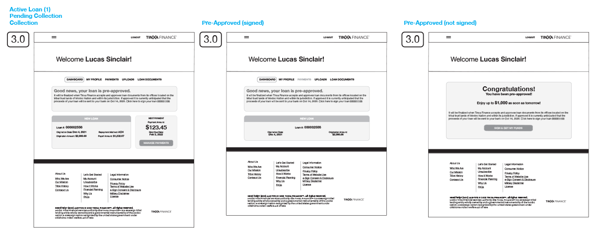
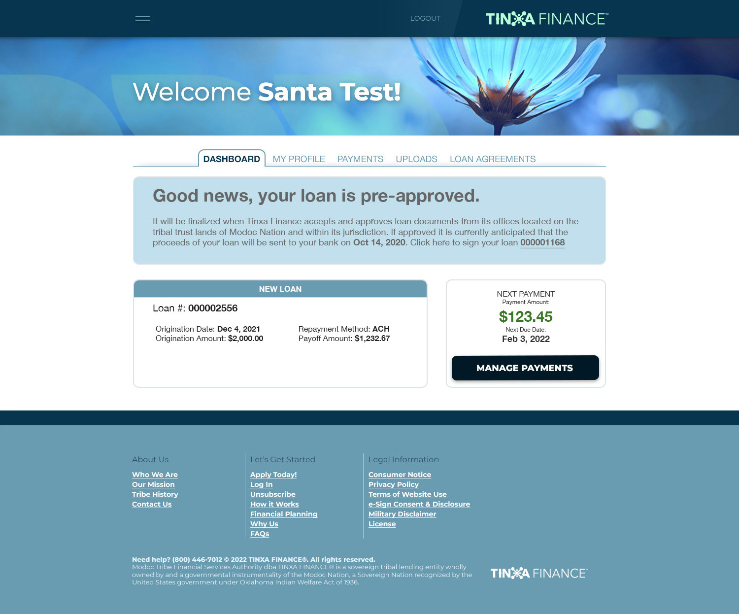
The dashboard serves as both action center and message center. Color (background and typography) prioritizes loan statuses—active, pending collection, or collections—ensuring users immediately understand their standing and required actions.
Key Decisions
A major win was unifying payment schedule and history into one data table with past and future payments in a single timeline. Past payments used green color and "Paid" icons for immediate recognition.
For mobile, we collapsed columns into single cells for easy vertical scrolling. On desktop, a sidebar highlighted next payment details; on mobile, this moved to the top as first content—prioritizing based on device.
Since most users were on autopay, updating payment information through My Profile was simple and essential. Users could also make additional payments or pay off early anytime.
Final Design
The portal delivered comprehensive yet focused loan management. The customized dashboard immediately communicated status and relevant actions. The unified payment table provided complete loan timeline visibility, while mobile optimization ensured seamless cross-device performance.
Most traffic came from returning users managing accounts, validating our account management focus. The mobile-first approach proved essential with the majority accessing from mobile devices. Customizing based on user status and loan phase ensured each user saw exactly what they needed.
Impact
Most portal traffic came from returning users managing accounts, validating the importance of account management features. The mobile-first approach proved essential, with the majority accessing from mobile devices.
Customizing the portal based on user status and loan phase was a major accomplishment, ensuring each user saw exactly what they needed.
Takeaways
This project reinforced keeping an eye on the big picture—one function change can have widespread implications. Tracking changes and their system impact was critical.
Building modular components paid off, consolidating functional code for easier management. This architecture with Angular positioned the portal for long-term success and scalability.