Tinxa Finance:
Brand/Identity
Establishing a brand identity and implementing it across multiple channels. (2020)
The problem
Tinxa was a brand new financial product serving customers who don't need perfect credit to succeed. In our traditional Tribal language, Tinxa means to succeed or to have luck—we believe everyone deserves to succeed.
The challenge was creating a branded product that was modern and appealing while establishing trust and professionalism in the financial services space.

My Role
As Creative Director and Designer starting in 2020, I was given the opportunity to build the brand from scratch. An initial logo concept from the tribe didn't resonate as intended, so I explored and discovered a new direction that would evolve over the following years.
Challenge
The brand needed to be trustworthy, professional, and reliable while maintaining accessibility. The visual language needed to showcase premium elements that worked seamlessly across all channels—web, email, social media, print materials, and vendor partnerships.
Goals
Our brand promise: Smarter tools. Better results. The visual language needed to convey that we're smart, innovative, and insightful while maintaining a feeling of accessibility. Every element should hint at possibility—the vast people who could become customers and the vast future ahead when accessing the power of Tinxa.
Methods
I explored typefaces and logo concepts first, then developed several color palette options to gain stakeholder buy-in and determine the right direction. The palette needed to work on both dark and light backgrounds and translate well across various uses.
![]()
Working closely with stakeholders, I gathered feedback throughout the process to ensure the brand resonated with both internal teams and our target audience.
Insight
The key was balancing premium, trustworthy aesthetics with approachable, accessible design. The brand needed flexibility to work across diverse channels while maintaining consistency through clear guidelines.
![]()
Design Process
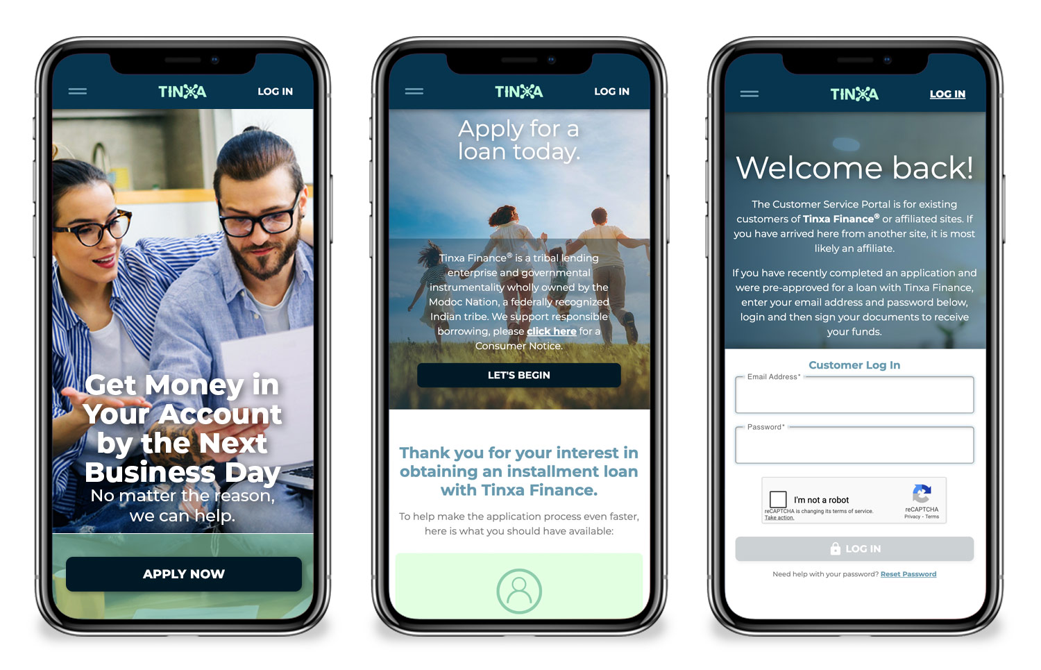
I created a stylized wordmark where the X in Tinxa became a "bug" that could function as a standalone icon. This jack-like mark worked well as a watermark and as a visual element in headers and footers. The full brand name "Tinxa Finance" and shortened "Tinxa" provided flexibility for different contexts.
Ideation & Prototyping
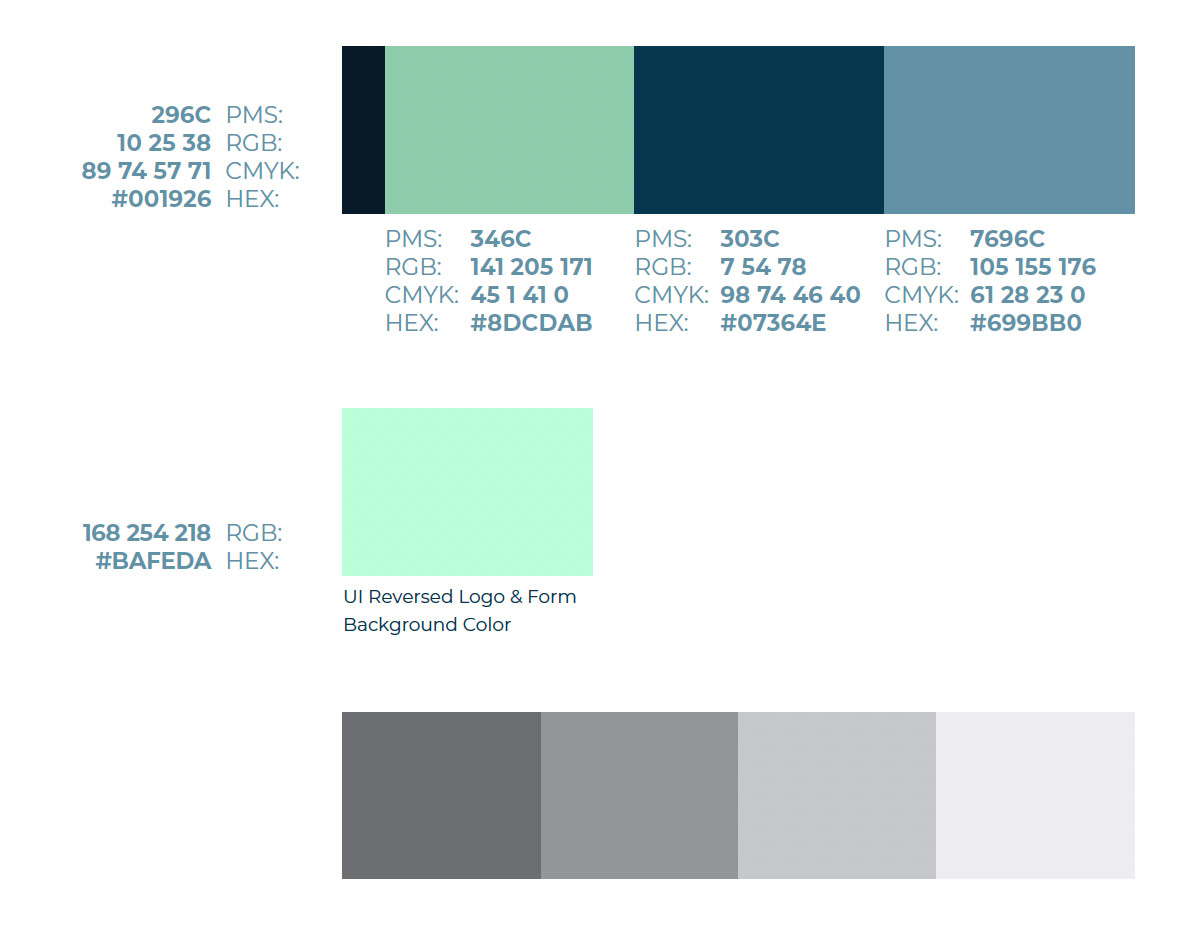
The color palette combined mint green (#8DCDAB) for freshness and approachability, deep navy (#07364E) for trust and professionalism, medium blue (#699BB0) for balance, and very dark navy (#001926) for premium sophistication.
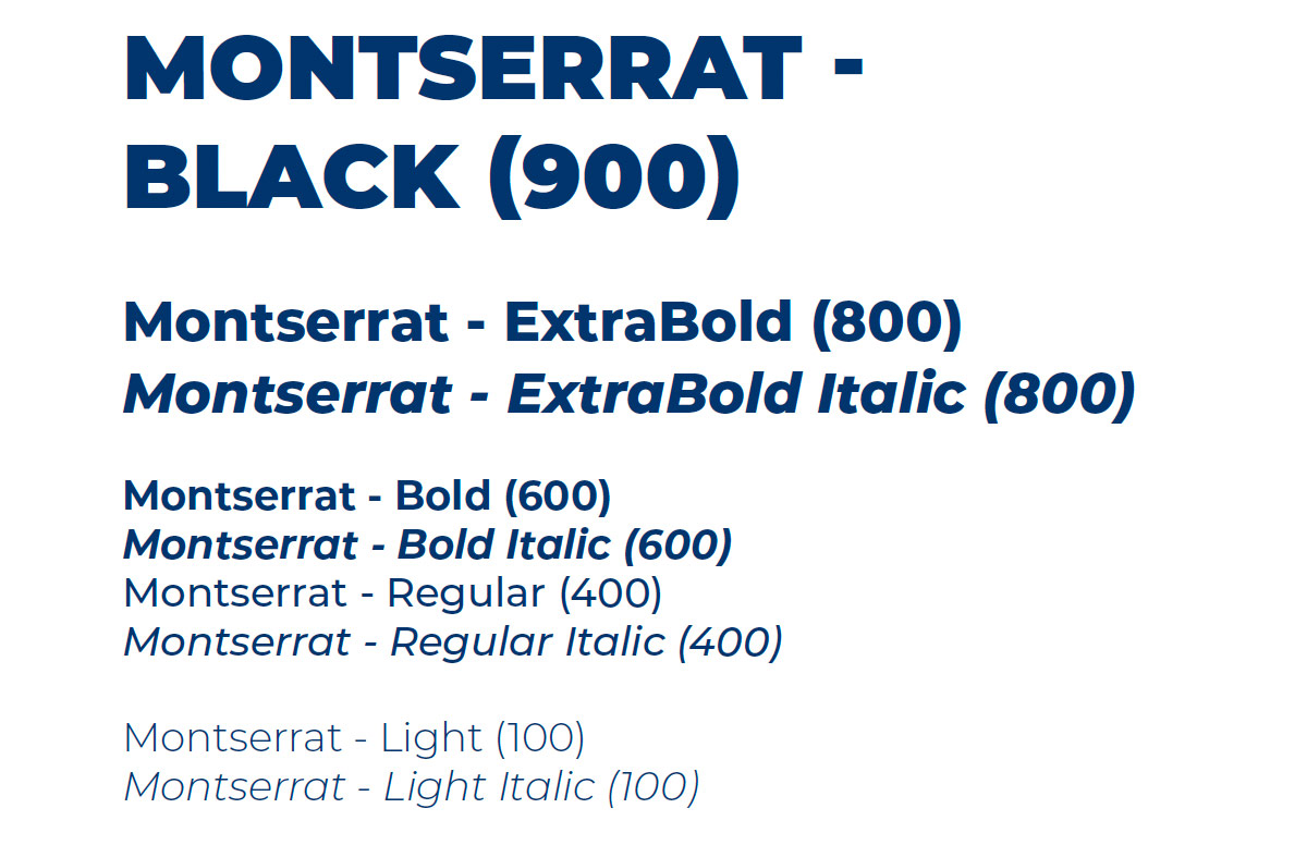
For typography, I selected Montserrat across four weights (Light 100 to Black 900) for its modern, clean versatility.
Key Decisions
I created comprehensive PDF brand guidelines covering logo usage, color palette and hierarchy, typography, color principles, and photography standards.
Color principles focused on:
- Accessibility: Meeting contrast standards for the 8-10% of people with color blindness and visually impaired users
- Avoiding overload: Using full-bleed backgrounds strategically without overwhelming
- Creating focus: Pairing primary colors with neutrals and white for dimension
Photography guidelines ensured imagery:
- Told meaningful, authentic stories
- Highlighted product in real-life context
- Connected with diverse audiences
- Improved UX by making products feel useful and personal
Final Design
The brand successfully balanced premium professionalism with accessibility. The flexible color system worked across light and dark applications, while the X bug provided a distinctive, versatile brand mark. Typography and imagery guidelines ensured consistency while allowing creative expression across channels.

Takeaways
Leave no stone unturned. Even if a direction proves wrong, challenge yourself to think beyond the safe path and take risks in exploration. Building a complete brand system from scratch reinforced the importance of comprehensive guidelines and the ongoing work required to maintain brand consistency across multiple touchpoints.