Tinxa Finance:
Apply Today!
When dealing with your personal finances, consumers want a painless experience. (2024)
The problem
Tinxa Finance was launching a new installment loan product that would allow pre-approved customers to select their loan amount and number of installments. However, the existing short-term loan application provided a cautionary tale: too many steps, a cumbersome user experience, potentially confusing navigation, and high drop-off rates with significant cart abandonment before completion.
Competitive research revealed similar issues across the market. Most financial products we reviewed lacked quality mobile optimization—a critical gap given that the vast majority of our target audience would be applying from their phones.
Challenge
As Lead UX/UI Designer and Frontend Developer, I worked closely with a cross-department team of stakeholders, operations managers, product owners, writers, marketers, and developers to create a new application experience from the ground up.

The challenge was clear: design an application flow that was streamlined, mobile-optimized, and significantly better than both our existing product and the competition. While most products utilized 5 steps, we set an aggressive goal of completing the application in no more than 3 steps.

Goals
Our primary goal was to create a painless application experience users could complete quickly and confidently from any device. With over 90% of our audience using mobile devices, mobile optimization was mission-critical to the product's success.

Methods
We conducted competitive analysis of installment loan products to understand common practices and identify opportunities. Most competitors used 5-step flows with poor mobile optimization.
We analyzed the existing short-term loan application to understand where users struggled and abandoned the process. Working with operations, product, and marketing teams, we identified essential information and how to reorganize it to reduce cognitive load.

Insight
Users needed manageable, bite-sized form entry that kept them focused one step at a time. Progressive disclosure would prevent overwhelm while maintaining momentum.
We could achieve our 3-step goal by organizing information around what users were providing—personal, employment, and bank information—rather than internal business needs.
Design Process
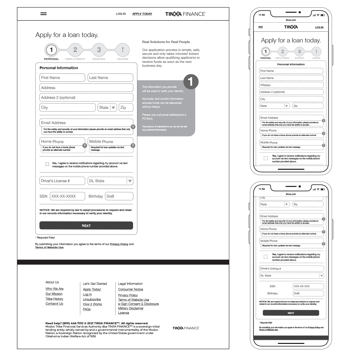
We determined a stepped approach with progressive disclosure would help users focus on one manageable section at a time. The challenge was consolidating the typical 5-step flow into just 3 steps while capturing all necessary information.
Ideation & Prototyping
We landed on a logical structure based on information type:
- Personal Information
- Employment Information
- Bank Information
For mobile optimization, we focused on appropriate input types, generous touch targets, and clear navigation between steps. Each step was designed to work seamlessly on small screens without sacrificing clarity or usability.

Key Decisions
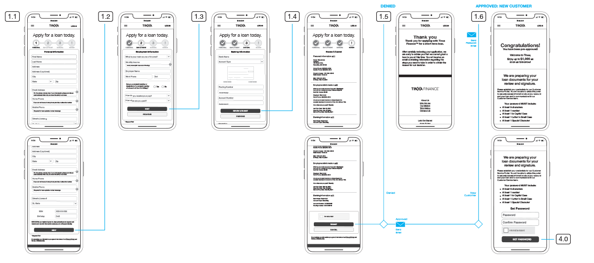
A critical addition was a comprehensive Review & Edit step. Rather than forcing users to click through each step to make changes, we displayed their entire application at a glance with the ability to edit any section directly. This gave users confidence everything was correct before submission.
Once satisfied, users simply set a password using their email as their username and submitted. After submission, the system processed their application, and pre-approved users continued directly to select their loan amount, choose installments, and sign documentation—all while already logged in.
Final Design
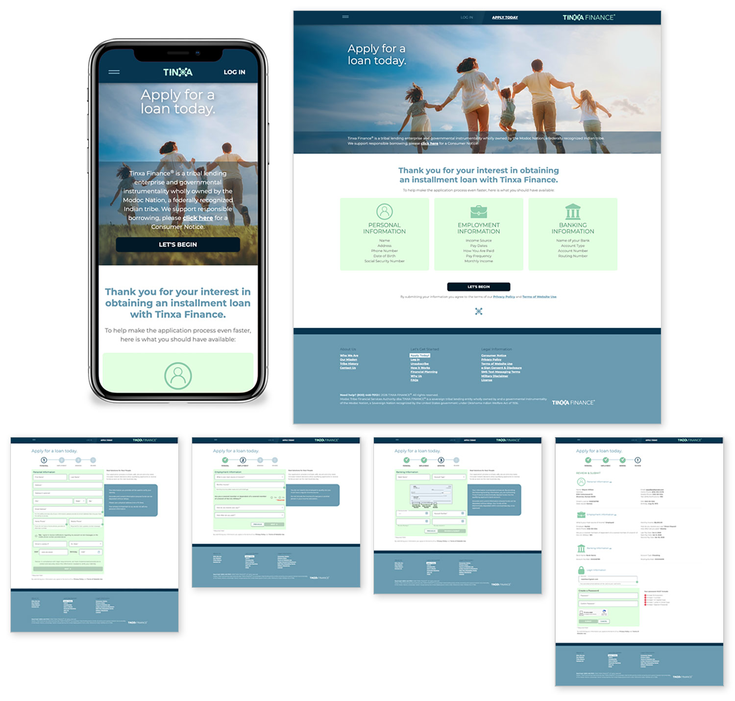
The final application delivered a streamlined 3-step experience with a review/submit flow that felt effortless. Users progressed through personal, employment, and bank information with clear focus at each stage. The comprehensive review screen allowed them to verify everything at a glance and make edits without navigating back through multiple steps.
The mobile-first design ensured the experience was optimized for the 90%+ of users applying from phones and tablets, with appropriate input types, generous touch targets, and intuitive navigation throughout.
Impact
The mobile-optimized experience proved essential, with over 90% of applications coming from mobile devices. Users were able to complete the application quickly and confidently, with the review step providing reassurance before submission.
The seamless transition for pre-approved users—already logged in and ready to customize their loan terms—created a frictionless path from application to funding.

Takeaways
Working with numerous cross-functional teams required active listening and willingness to pivot and explore various options. Balancing stakeholder requirements with vital user needs and expectations was essential for delivering a successful product.
This application needed to be mobile-first without question, but also needed to be maintainable long-term. We chose Angular as the frontend technology and leveraged it to produce a first-class product that served both user needs and business goals.